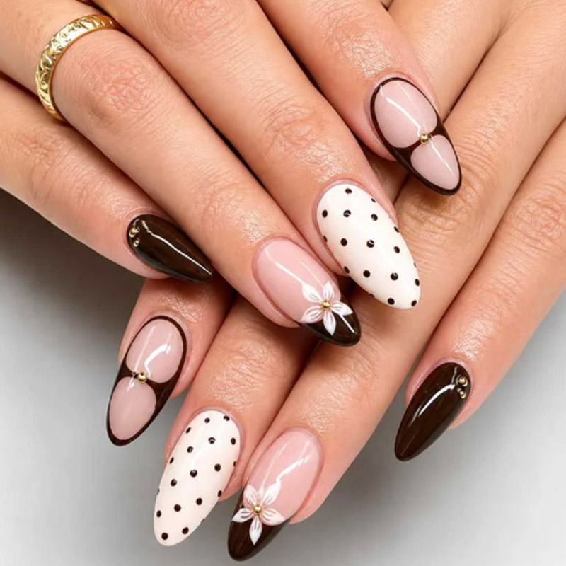
Deep red has an unusual advantage in nail collection development: it can feel classic, romantic, dramatic, seasonal, or fashion-forward depending on what surrounds it.
That flexibility is especially valuable when developing 爪にフローラルプレス.
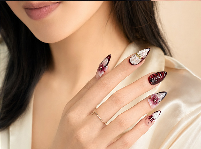
A burgundy base can support delicate botanical artwork for a romantic collection, black lace for a darker evening range, gold details for an occasion-focused product, or a translucent gradient for a softer interpretation. The same basic color family can therefore support several SKUs without forcing a brand to invent a completely unrelated visual direction for every product.
Burgundy is also particularly relevant in 2026. Current nail coverage continues to identify deep wine and burgundy shades as important color directions, while dark romantic florals, glossy finishes, metallic details, and richer red tones are appearing across contemporary manicure inspiration. (Allure)
For beauty brands, however, simply choosing burgundy is not enough.
The key questions are:
- Which burgundy tone should be used?
- Should the finish be glossy, sheer, cat-eye, or gradient?
- How much floral artwork should appear?
- Can lace and flowers coexist without making the nail too busy?
- Which shapes work best?
- How should smaller nail sizes be simplified?
- Which designs should become core products and which should remain statement pieces?
This guide explains how brands can use burgundy to build a coherent 爪にフローラルプレス collection across floral, lace, gradient, metallic, and dimensional design directions.
Why Burgundy Works So Well for Floral Press On Nails
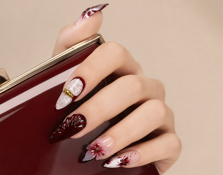
Burgundy sits between classic red and darker wine, plum, or near-black tones.
That makes it flexible.
It can communicate warmth without becoming as bright as cherry red, while still providing more visible color than black.
向け 爪にフローラルプレス, this creates useful contrast.
Flowers can be:
- White
- ピンク
- Burgundy-on-burgundy
- 黒
- ゴールド
- シャンパン
- クリーム
and still remain visible against the base.
Current 2026 color coverage describes burgundy as particularly versatile, with glossy finishes creating depth while matte versions can produce a more vintage appearance. (Allure)
That gives product developers several ways to use the same color without creating duplicate products.
例えば:
Product A: Glossy burgundy with micro flowers Product B: Sheer burgundy with black lace Product C: Burgundy gradient with floral accents Product D: Burgundy cat-eye with gold flowers
All four belong to the same color family while serving different customers.
Burgundy Is Not One Color
One of the first mistakes when developing 爪にフローラルプレス is treating burgundy as one fixed shade.
Burgundy can lean toward:
- 赤
- Wine
- ベリー
- Purple
- ブラウン
- 黒
Each undertone changes the product.
Red-Leaning Burgundy
This feels closest to classic red.
それは次のためにうまく機能します:
- Romantic collections
- Glossy florals
- Gold decoration
- Holiday-adjacent products
Wine Burgundy
Wine tones create greater depth.
They work particularly well with:
- Lace
- 暗い花柄
- 真珠
- 猫目
- Gradient effects
Purple Burgundy
This direction can make 爪にフローラルプレス feel more fashion-led.
Useful pairings include:
- ラベンダー
- 黒
- シルバー
- ピンク
Brown Burgundy
Brown undertones can create a warmer and more muted result.
This can work well for fall collections and antique-inspired florals.
Before sampling, the brief should therefore define the burgundy direction rather than simply writing:
> Burgundy.
Use Glossy Burgundy as the Core Product
Every burgundy collection benefits from at least one relatively simple product.
A glossy solid-color set can establish the core color before more complex 爪にフローラルプレス are introduced.
Possible shapes include:
- ショートスクエア
- オーバル
- 中 アーモンド
This product can serve as the visual anchor.
The same approved burgundy can then appear in:
- Floral designs
- Lace designs
- Cat-eye products
- Gradient products
This creates consistency across the collection.
It also gives customers who like the color but do not want detailed artwork a simpler option.
Build Micro Floral Press On Nails for Wearable Customers
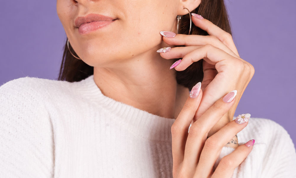
Flowers do not need to dominate the whole nail.
For more wearable 爪にフローラルプレス, use smaller motifs.
考えられる組み合わせには次のようなものがあります:
Burgundy + White Micro Flowers
A strong contrast with a romantic direction.
Burgundy + Pink Florals
Creates a softer tonal relationship.
Burgundy + Gold Botanical Lines
More decorative without requiring large flowers.
Burgundy + Nude Negative Space
Allows the floral artwork to feel lighter.
A medium almond or oval shape works particularly well for this type of product.
The most important design principle is negative space.
If every surface is filled with dark burgundy and dense flowers, the product may become visually heavy.
Small floral elements allow the base color to remain visible.
Burgundy and Lace Create a Different Type of Floral Product
Lace introduces another layer of detail.
Instead of using a literal lace pattern across every nail, 爪にフローラルプレス can borrow lace characteristics such as:
- Fine black lines
- Scalloped edges
- Mesh-like sections
- Botanical lace motifs
- Transparent sections
Dark romantic floral designs have remained visible in 2026 manicure coverage, including combinations of oxblood or dark bases with delicate floral and lace-like detailing. (Byrdie)
A burgundy lace collection can therefore feel romantic without becoming traditionally bridal.
Useful designs include:
Sheer burgundy + black floral lace
または:
Nude base + burgundy French + lace accent
または:
Glossy burgundy + one lace accent nail
The key is not to cover every nail with the same complex pattern.
Use lace as an accent.
Use Sheer Burgundy to Make Lace More Visible
Opaque burgundy creates strong depth, but sheer burgundy can sometimes work better with detailed artwork.
A translucent base allows:
- Black lace
- ゴールドラインアート
- ファインフラワー
- Negative space
to remain visually distinct.
向け 爪にフローラルプレス, the difference between opaque and sheer burgundy should be approved physically.
A digital mood board may not accurately show how transparent the final product should be.
During sampling, compare:
- One layer appearance
- Final intended opacity
- Artwork visibility
- Color consistency across nail sizes
The approved physical sample should become the reference.
Gradient Burgundy Creates a Lighter Alternative
A burgundy collection does not need every product to be fully dark.
Gradient designs allow the color to move from:
- Nude to burgundy
- Pink to burgundy
- Clear to burgundy
- Dark burgundy to lighter wine
これは作ることができます 爪にフローラルプレス feel more dimensional.
例えば:
ベース: nude-to-burgundy gradient アートワーク: small white flowers 形状: 中 アーモンド
または:
ベース: translucent berry gradient アートワーク: fine gold botanical detail 形状: オーバル
The gradient can become the main visual effect while floral decoration remains limited.
This is often more balanced than combining a strong gradient with several large decorations.
Burgundy Ombre Should Be Checked Across Nail Sizes
Gradients become harder to reproduce consistently when nail sizes change.
A large thumb provides more distance for the color transition.
A small nail provides less.
For gradient 爪にフローラルプレス, buyers should therefore review:
- 最大 ネイル
- 中釘
- 最小 ネイル
Ask whether the transition still looks intentional on every size.
If necessary, smaller tips can use:
- A shorter gradient
- Simpler artwork
- Fewer flowers
The objective is visual consistency rather than identical millimeter measurements.
Burgundy Cat-Eye Can Become the Fashion Product
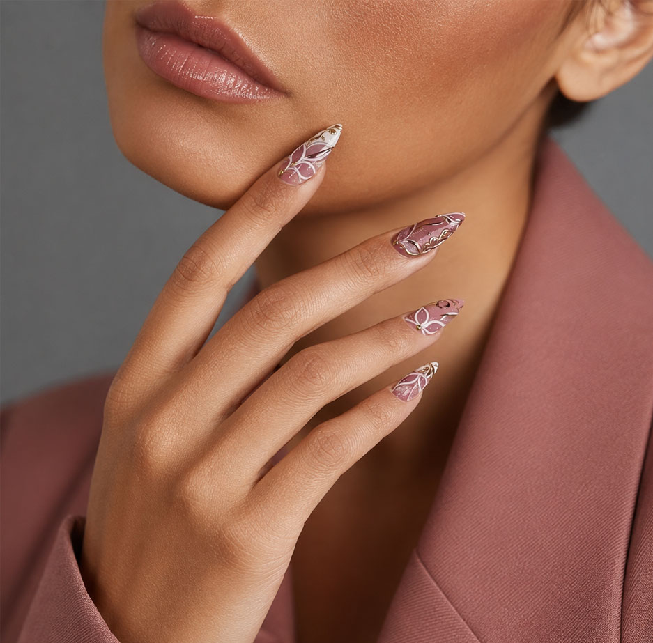
Burgundy also works particularly well with magnetic cat-eye finishes.
The darker base provides enough contrast for the reflective particles to remain visible.
A burgundy cat-eye set can work as the fashion layer within a broader 爪にフローラルプレス コレクション.
考えられる組み合わせには次のようなものがあります:
- Burgundy cat-eye + gold flowers
- Burgundy cat-eye + black botanical lines
- Burgundy cat-eye + pearl accents
- Burgundy cat-eye + one floral hero nail
The magnetic reflection should remain visible.
Avoid covering every nail with dense artwork.
If cat-eye is the hero technique, flowers should support it rather than hide it.
Combine Burgundy With Gold Selectively
Gold is one of the most natural metallic partners for burgundy.
It can appear as:
- Fine botanical lines
- Flower centers
- ホイル
- French borders
- 金属製の小さな装飾
向け 爪にフローラルプレス, gold works best when it has a clear role.
例えば:
Burgundy base + white flower + gold center
is easier to understand than:
Burgundy + flowers + foil + large gold charms + glitter + rhinestones
More decoration does not automatically create a stronger product.
A limited metallic accent can make the burgundy appear deeper.
ブランドはXingyi'sをレビューできます ブルゴーニュ ブロッサム ゴールド when developing burgundy, floral, and metallic design combinations.
Burgundy and Pearl Create a Softer Direction
Gold is not the only option.
Pearls can soften darker 爪にフローラルプレス and create a more romantic or occasion-oriented product.
Possible uses include:
- Pearl flower centers
- One pearl accent nail
- Burgundy French with pearl detail
- Sheer burgundy florals with small pearls
This direction can work well for:
- 結婚式
- 正式なイベント
- 夕方のコレクション
- Romantic capsules
A darker color does not prevent the product from feeling elegant or bridal-adjacent.
The combination simply creates a less traditional interpretation.
Match Burgundy Floral Press On Nails to the Right Shape
Shape changes the mood of the same color.
ショートスクエア
Works well for:
- Solid burgundy
- Micro floral accents
- Fine gold French
- Minimal lace
This is a strong wearable option.
オーバル
以下でうまく機能します:
- Soft florals
- 真珠
- Lace
- Gradient designs
The rounded shape complements romantic artwork.
アーモンド
Almond is one of the most flexible shapes for burgundy 爪にフローラルプレス.
It works with:
- 手描き
- 猫目
- グラデーション
- 3D フラワーズ
- Gold details
棺
Useful for stronger statement designs.
The larger surface can support:
- Lace panels
- Multiple flowers
- 3Dデコレーション
- Graphic burgundy-and-black designs
ブランドはXingyi'sをレビューできます 形状とサイズのガイド before choosing the silhouette for each product family.
Use Handmade Florals as the Signature Layer
A burgundy collection can contain several production levels.
例えば:
コア
Solid glossy burgundy.
ファッション
Burgundy cat-eye.
Enhanced
Micro floral or lace accents.
手作りのサイン
Detailed hand-painted 爪にフローラルプレス.
ヒーロー
3D floral burgundy product.
This creates visual progression.
Handmade products can carry:
- Layered petals
- Botanical artwork
- Gold detailing
- Lace-inspired hand painting
- 真珠
without requiring every product in the collection to become equally complex.
Xingyi の ブルゴーニュ ブルーム レース provides a useful internal reference for combining burgundy with floral and lace-inspired elements.
3D Flowers Need More Restraint on Dark Bases
A dark background already creates strong visual weight.
Large 3D decoration adds even more.
For burgundy 爪にフローラルプレス, use dimensional flowers strategically.
A balanced ten-finger composition might contain:
- Two hero floral nails
- Two supporting botanical nails
- Several simple burgundy nails
- One or two metallic accents
This allows the 3D flowers to stand out.
If every nail contains a large flower, the collection may lose hierarchy and create more packaging difficulty.
Packaging Should Reinforce the Burgundy Palette
Burgundy products can work with several packaging directions.
Cream Packaging
Provides contrast and keeps the collection softer.
Burgundy Packaging
Creates strong color consistency.
Black Packaging
Supports darker lace and evening designs.
Neutral + Gold
Works well for more refined floral products.
向け 爪にフローラルプレス, packaging should not compete with the artwork.
If the nails contain detailed lace, flowers, and metallic accents, a very complex printed background may make the complete retail product feel visually overloaded.
The physical package should also provide sufficient space for 3D decoration.
Brands can discuss nail design and private label packaging through Xingyi’s カスタマイズされたサービス.
Build a Five-SKU Burgundy Collection
A beauty brand does not need dozens of burgundy designs.
A focused collection could contain five clearly different products.
SKU 1 — Core Burgundy
形状: ショートスクエア Finish: 光沢 Role: Everyday color
SKU 2 — Burgundy Gradient
形状: オーバル Finish: Glossy gradient Role: Softer fashion product
SKU 3 — Floral Press On Nails
形状: 中 アーモンド デザイン: Burgundy base with fine painted flowers Role: Signature
SKU 4 — Burgundy Lace
形状: 中 アーモンド デザイン: Sheer burgundy + dark lace Role: Romantic fashion
SKU 5 — Burgundy 3D Floral
形状: ロングアーモンド デザイン: Sculptural floral accents + selected metallic detail Role: Hero product
Each SKU uses the same color family but serves a different customer need.
Sample the Collection Together
Burgundy can shift noticeably between:
- 赤
- Purple
- ブラウン
- 黒
depending on the formula and finish.
If several 爪にフローラルプレス belong to one collection, review them together.
尋ねる:
- Do the burgundy tones look related?
- Is one product unexpectedly purple?
- Does the gradient match the solid base?
- Does the cat-eye still belong to the palette?
- Are gold tones consistent?
- Are flowers balanced across the collection?
Physical samples are particularly useful because reflective and translucent finishes can look different in photographs.
Keep an Approved Burgundy Reference
Once the brand approves its main burgundy tone, retain the physical sample.
That reference can be reused when developing:
- New flowers
- Lace designs
- 猫目
- French styles
- Seasonal variations
This is especially useful for 爪にフローラルプレス because several products may share the same background color.
A controlled color reference makes future product families more coherent.
Common Burgundy Collection Mistakes
Treating Burgundy as One Universal Shade
Define the undertone.
Making Every Product Opaque
Use sheer and gradient variations.
Adding Too Much Gold
Metallic detail should support the color.
Making Every SKU Floral
Use solid, gradient, lace, and magnetic products too.
Using the Same Flowers on Every Design
Change scale, composition, and production complexity.
Overdecorating Dark Bases
Leave visual breathing room.
Ignoring Small Nail Sizes
Scale floral artwork and decoration.
Approving SKUs Individually
Review the entire burgundy family together.
Questions to Answer Before Production
Before approving burgundy 爪にフローラルプレス, confirm:
- Which burgundy undertone is being used?
- Is the base opaque, sheer, or gradient?
- Which finish is approved?
- What floral style is required?
- Does lace appear on every nail or only accents?
- Which metallic tone is used?
- Are 3D flowers necessary?
- Does artwork scale correctly to smaller nails?
- Does the complete collection use consistent burgundy references?
- Does packaging protect dimensional designs?
- Are physical samples retained for future reorders?
These questions help transform one fashionable color into a repeatable product family.
結論
Burgundy works particularly well for 爪にフローラルプレス because it can support several different moods without losing its identity.
The same color family can become:
- Wearable glossy nails
- Romantic floral designs
- Dark lace products
- Soft gradients
- キャットアイ仕上げ
- Gold-accented collections
- 3D floral statement pieces
Current 2026 nail coverage continues to support deep burgundy and wine tones as versatile color choices, while dark romantic florals provide another direction for brands that want something more distinctive than simple solid red. (Allure)
For product developers, the key is variation with control.
Do not make five nearly identical burgundy 爪にフローラルプレス. Give each SKU a specific role by changing opacity, finish, motif complexity, shape, or level of decoration.
Start with one approved burgundy reference, then build a family around it.
If you are developing a burgundy collection, you can review Xingyi’s ブルゴーニュ ブルーム レース, ブルゴーニュ ブロッサム ゴールド, 手作りカスタムプレスオンネイルコレクション, 、 および カスタマイズされたサービス while preparing your product brief.
When your burgundy tone, shape, floral style, finish, decoration level, and packaging direction are ready, you can 連絡 Xingyi to discuss physical samples for your next 爪にフローラルプレス コレクション.